
Techcyte Design System Foundations
Goals
1. Clear communication between website, print and product
2. Clear communication between design, development
3. Clear communication to customer of who we are as a brand
We have a disconnect.
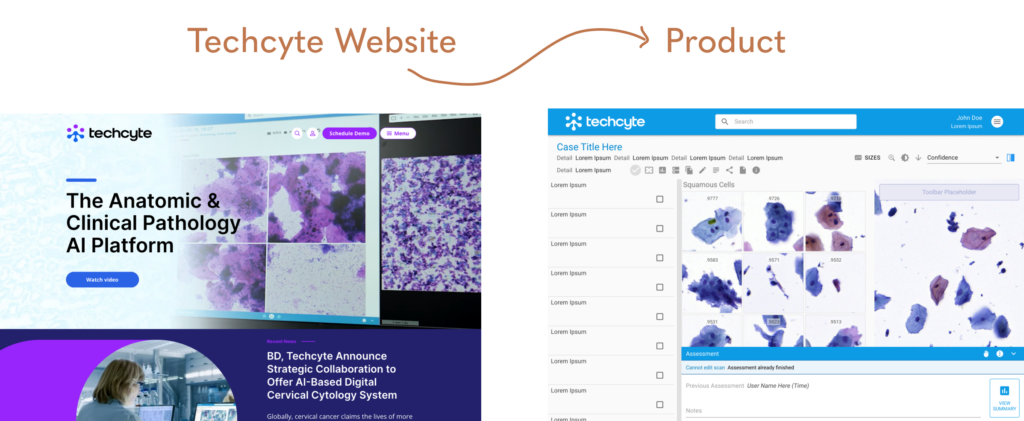
In 2022 our brand went through a revamp, but our product still had yet catching up to do.
There’s a disconnect in communication between these cross-functional teams.
Marketing is pushing strong in using these materials,
UX is applying these to designs incrementally, and
Development prioritizes reusable components, and so finds it easier to use existing materials.
How can we have everyone on the same page in using these awesome resources?
These are available for anyone to use- it’s available in our company shared drive but there’s still questions of when to use what colors, accessibility concerns, and more.
We can have a design system set up, but what good is it if there isn’t a clear cut way of communication and transferring assets between design and development.
Enter design tokens.
Building our design system in Figma enabled us to establish design tokens through variable libraries.
Our design system is organized using Atomic Design (Atoms, Molecules, Organisms) using Material Design as a baseline, as this is what our product has been built from.
- Atoms- logos, colors, typography
- Molecules- features, components
- Organisms- pages
Once we defined the primitive tokens, we defined semantic tokens that pointed to these primitive tokens.
The idea is, once defined, our designers, developers and PMs won’t ever have to worry about grabbing a hex code or figuring out which color, font, or shape to use.
It’s all linked together as design tokens and exportable to a JSON file for developers to plug into the code and all the assets pointing to these tokens will update automatically.
For example, a semantic token of primary.light would point to the techcyte.blue.800 primitive token. Any design assets using primary.light would be updated if the techcyte.blue.800 hex value was changed in the Atoms file.
Colors
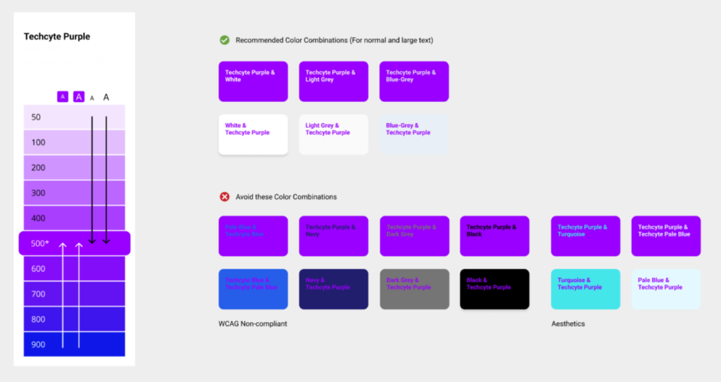
Since these colors would be the single source of truth for marketing, design and development, it’s important that they meet brand guidelines and accessibility standards.
Goal
Create a guide for designers to reference to in terms of contrast, which color to use when, etc.
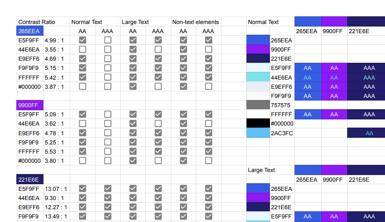
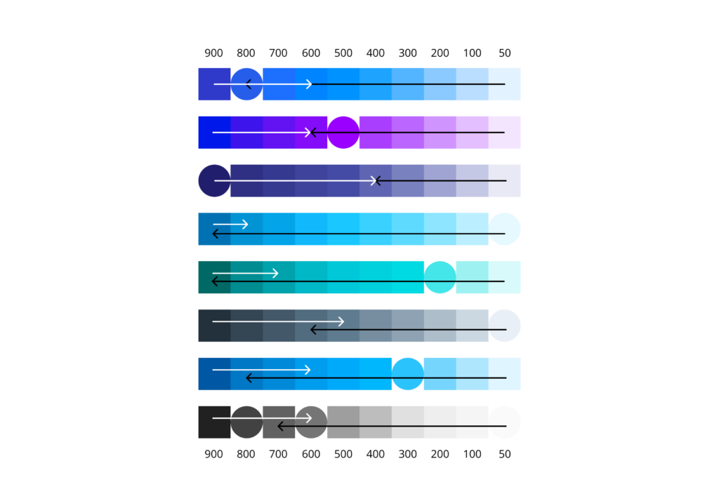
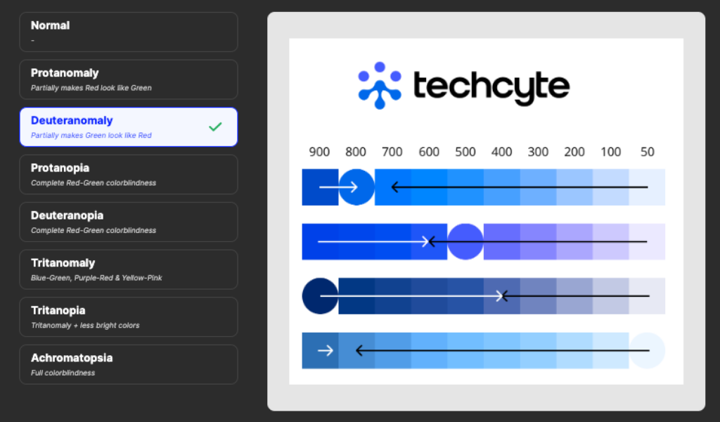
Once all the colors were established and audited, I got to designing light and dark themes.
Established dark themes using the palette scales- opposites that fit well together were key.
Typography
This was the next step in alignment with our brand guidelines. We originally started with Material Design’s Roboto, but wanted to better align with the corporate website.
This process wasn’t as intensive as the colors, as the type scale had already been established by marketing and needed to be plugged into the design system.
Did the same for our veterinary digital AI pathology product that follows our partner Zoetis’ branding. The Vetscan Imagyst product used the Zoetis branded orange, but had shades of the wrong orange hex value, and the typography could be updated too.

Design Tokens
Now that colors, typography and shapes had been audited and plugged into the design system, here came the fun part- connecting the design tokens to our designs. Now we could easily switch between themes, we don’t have to worry about elevation levels or what colors work best with each other, it all had been established.
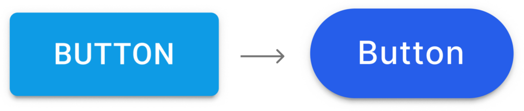
Form over function?
Whatever your answer, due to this foundational design system work, we as designers can spend less time sweating the details of the User Interface and dedicate more time to creating intuitive and functional user experiences.
All these changes help meet the goals:
Brand Communication
- Clear communication between website, print and product
- Clear communication between design, development
- Clear communication to customer of who we are as a brand
Accessibility
- WCAG compliance
- Color blindness accessible- for the most common form of colorblindness, Deuteranomaly.
What’s Next?
Now that the foundation is established, our designers can easily access these color, shape and typography resources and implement into their own designs. As we have built off of Material Design, we have been adjusting MUI components to point to our new branded design tokens. We are building out components and organisms to maximize reusability and reduce design debt.
Design Ops
UX Designer
UX Manager
Sarah Keeler
Greg Hart
Marketing
VP Marketing
Marketing Specialist
Troy Bankhead
Ashley Monsia