
What’s the story?
🗣️ As a veterinarian, vet tech, clinic user, I want to be able to select only the key areas of the slide I want scanned and classified by the AI- to get an accurate diagnose back to the patient faster in order to save time and possibly lives.
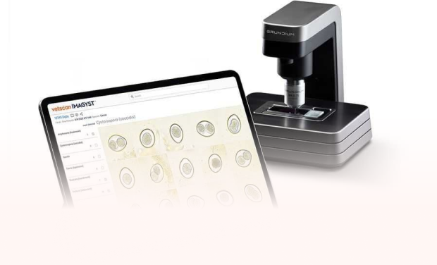
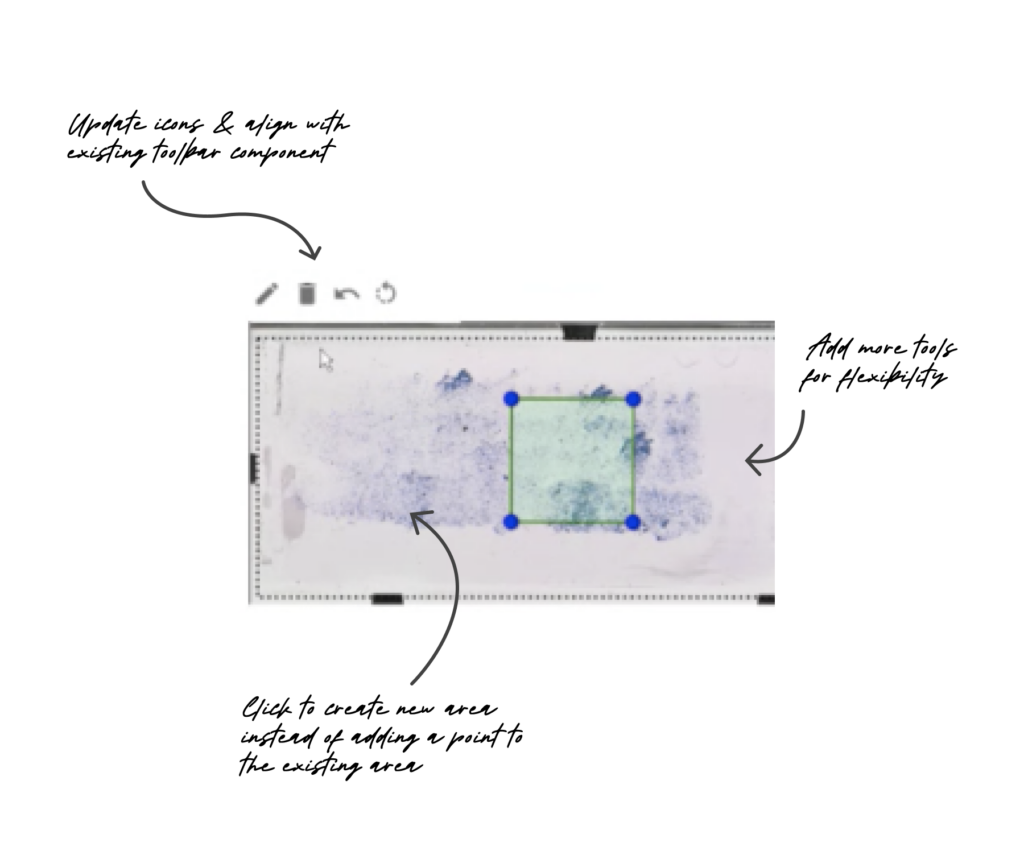
In the scan preparation part of the test order creation process, the current preview is limited and the tool icons are confusing at first.
-
- The pencil icon usually indicates edit or write- not create a new scan area.
- The current tool is acting as two tools- drop a preset shape, drag to create shape and click to create shape.
Goals
-
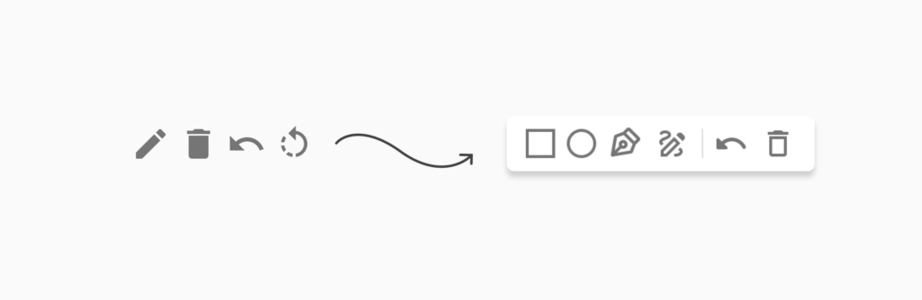
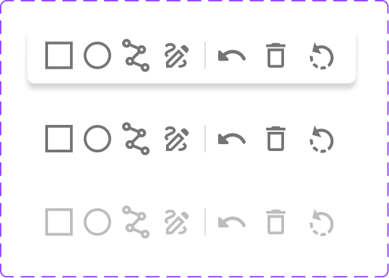
- Make the icons clear and applicable.
-
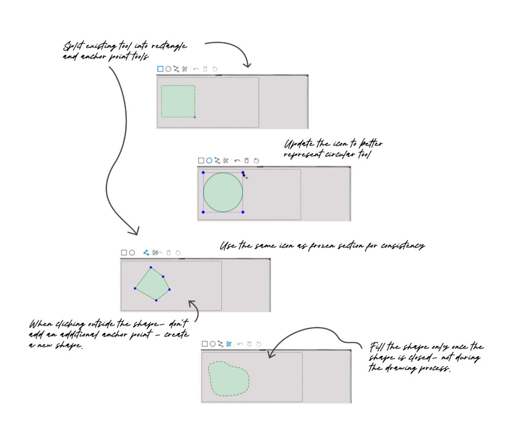
- Provide more tools for greater precision and flexibility by splitting the existing tool.
- Componentize – Reuse same tools used in a different part of the product- or make sure they speak the same language, because we had different icons for the same function.
Icon Ideation & Improvement
Technical Restraints & Dev Collab
As the circle tool went to build, it was found that circles weren’t read into the scanner as arcs, but as polygons with multiple vertices.
I foresaw a potential friction point here for users as the circle icon I initially proposed for the tool wouldn’t reflect the masked area that would show up on the slide preview.
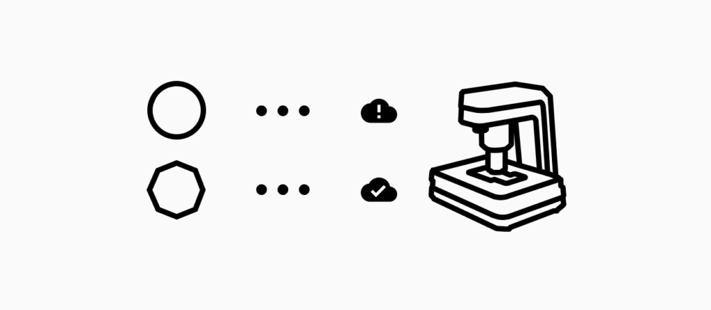
After iterating with the developer on this issue and finding no technical workarounds- we landed on representing the tool icon as a polygon shape to better reflect the actual function and reduce potential confusion for our users.
Masking Area Tools
As I tested the prototype internally- got feedback and further iteration, that’s where we knew we could provide more tools for the various approaches our users take for their needs.
In an effort to componentize- the existing “add new area” with rectangle and anchor point functionalities was split into two focused tools.
Then, another part of the product had similar tools- a free draw and anchor point so we introduced those options to the new array of scan mask tools and improved upon the UX.
Built iteratively- each tool at a time.
Impact
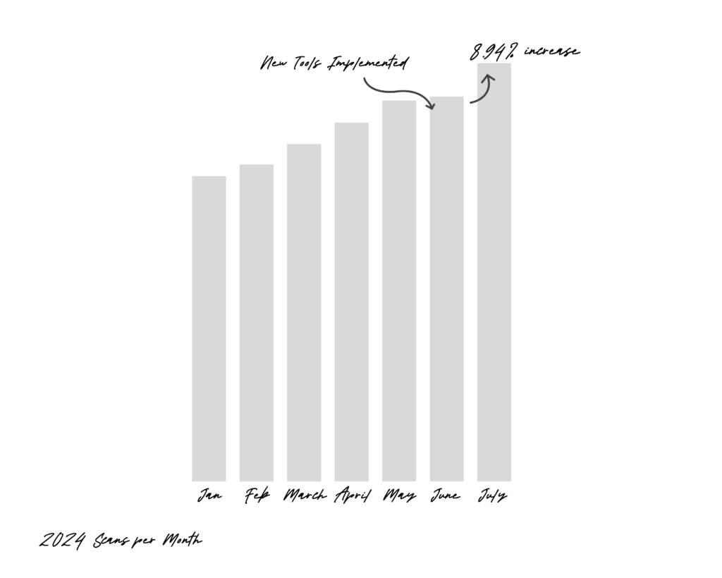
These tools have resulted in faster scan times and contributed to more scans per month with a 8.94% increase from the month it was implemented and down the line- helping improve patient outlook.
UX Designer
Developer
Product Owner
Sarah Keeler
Alex Lockwood
Liliia Paryliak